A logo is a graphic symbol or emblem, commonly used by commercial enterprises, organizations and individuals to promote public recognition. A logo embodies a brand and it can be a good way to remember something unmemorable. When it comes to car logos, most of them are pretty cool, memorable and well thought-out. Automakers want to project symbols of durability, pride and power with their logos. Some end up boring and others end up-amazing and original. The logo is the most important part of a car brand’s image and the most basic expression of a car’s identity. Take a look at some of best and unique car logos and discover the story behind their creation!
Alfa Romeo
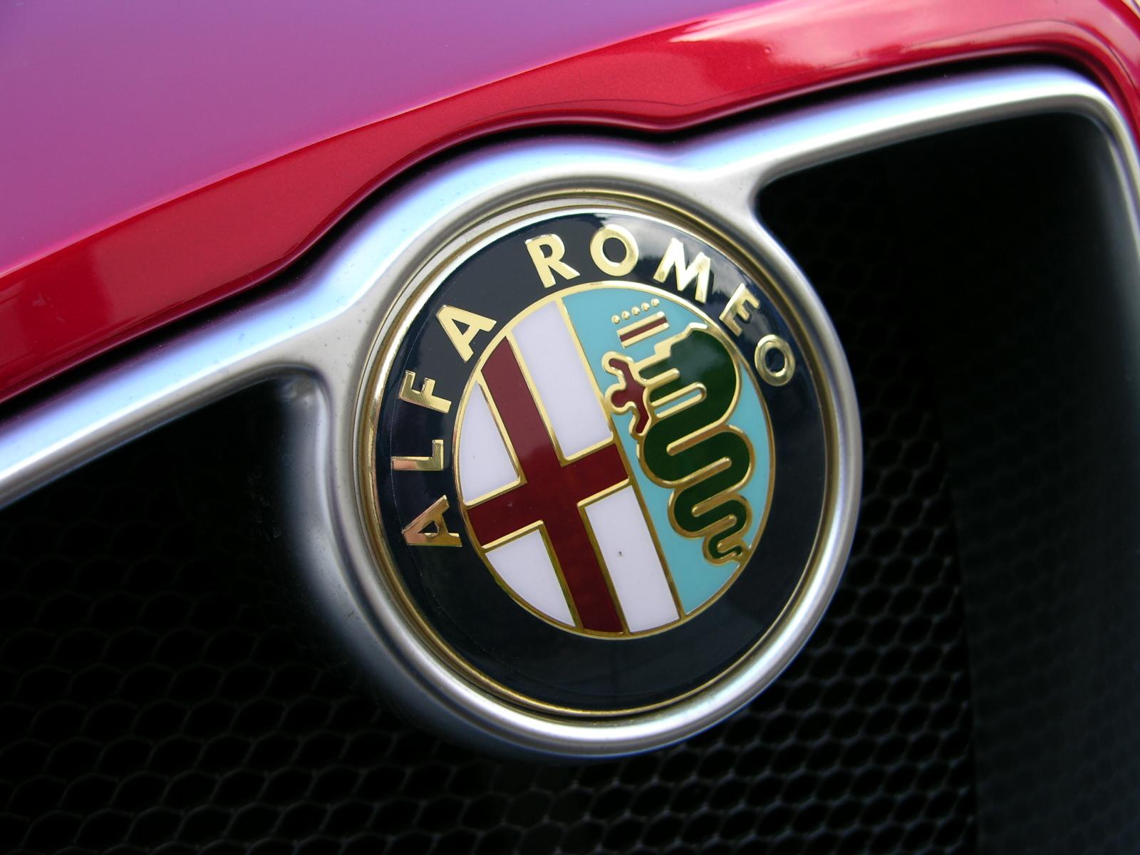
The Alfa Romeo badge is definitely one of the coolest car logos ever made. The Alfa Romeo logo has been changed many times since the foundation of the company in 1910. There are many myths associated with the logo’s design. However, it is generally accepted that the logo is based on the coat of arms of the Visconti family and the red cross on a white background of Milan. In the 5th century AD there was a snake that devoured people in the area around Milan. It was slain by Ottoni Visconti and his heroic dead was celebrated as part of the coat of arms. A.L.F.A. comes from the company’s name: Anonima Lombarda Fabbrica Automobili and the original logo has Alfa written over the top of the emblem and Milano underneath separated by two figure of eight knots. Over time the knots were removed from the logo, while the other symbols underwent only minor changes.
Mercedes-Benz

Mercedes-Benz is a famous German car manufacturer that was founded by Karl Benz and Gottlieb Daimler in 1926. Mercedes-Benz famous and recognizable logo was originally created by Gottlieb Daimler and was featured in 1909. The three-pointed star symbolizes the company’s dominance on the land, the sea and the air. As expected, the logo has undergone several changes over time that usually followed the growth of the company.
Peugeot
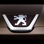
When it comes to the history of the logo, Peugeot certainly has something to say. The French lion was designed by Justine Blazer, who worked as a jeweler and engraver back in 1847. The logo has appeared on Peugeot cars a few year later, and over the years has undergone numerous changes. The latest changes were made in 1998 and 2002 when the company refreshed the lion’s appearance in order to better highlight the “message” that the logo conveyed: Peugeot logo signifies strength and balance, while it is believed that the color blue represents the vision of the future of this company.
Ferrari
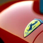
Almost every car enthusiast knows about the “prancing horse”, thanks to the significant achievements of the Italian manufacturer Ferrari. According to the story about the Ferrari logo, the horse was first painted on the fuselage on the fighter plane of Francesco Baracca, who was a heroic airman during the First World War. The company’s founder Enzo Ferrari met the hero’s parents and his mother Countess Paulina asked Ferrari to put her son’s prancing horse on his cars. The black prancing horse on a canary yellow background is still seen on all Ferrari cars.
Related Posts
 Unique Lighting Fixture: Take Your Home From Ordinary To Extraordinary
 Have Your Coffee With Style With Unique Bodum Coffee Plunger
 Spirit Essences: Give Homemade Whiskey a Unique Flavour
 How to Pick the right Light Fitting for Every Room in Your House
 The Purpose of Starter Motors, Drives and Solenoids and How to Replace Them